Good and bad practices for real-time validation of mobile forms – Inline Validation
Mobile applications allow users to perform increasingly complex activities. Using Meritum bank’s new app, we can already open a personal or business account – all without visiting a bank branch or sending a contract by courier. The result of introducing such functionality is often more complicated interface elements, especially forms.
This complexity, in turn, increases the likelihood of error. Problems arise even when filling out simple, two-element login forms. The more we are exposed to them when entering more data.
Validation mechanisms are an important part of a robust form design. A lot has been written on the subject of form validation, I personally recommend Marcin Treder’s article, which solidly and comprehensively describes the topic.
I, on the other hand, decided to provide examples of solutions that assist users in properly completing mobile forms. In the forms described here, real-time validation was used (the. Inline Validation), which occurs immediately after a form field is filled out.
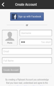
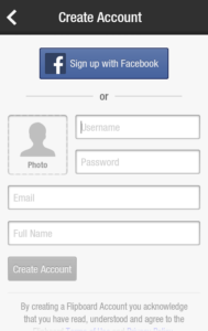
The Flipboard application uses two ways to communicate an error. When you enter a username that is already taken, a red symbol appears in the field. Unfortunately, this mechanism does not assist the user.
They don’t know what mistake they made or how to correct it.
The situation looks much better when we enter e.g. too short a slogan. In this case, a “too short” message is displayed. Too short). The user immediately knows what the problem is.
The gray color of the message font is questionable. Red is a more appropriate color for this type of communication.
Skype

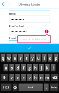

More user-friendly is the form validation in the Skype application. If a field is filled out incorrectly, a red symbol is shown, along with a conspicuous balloon explaining the causes of the problems and how to fix them.
The plus side of this solution is that it saves space. Smokes appear on a layer, so they do not interfere with the layout of the form elements.

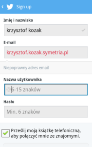

In the Twitter application, after entering the correct data, a corresponding symbol will appear at the right edge of the field (so called “Twitter”). “bird”). If the data is incorrect, an error message appears between the form fields.
A good solution is to change the font color of incorrectly entered data to red. The error messages appear very smoothly, without the impression of the form “rolling over”. However, they could stand out
also in color – currently they seem easy to overlook.
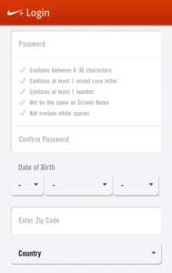
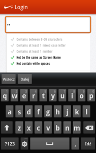
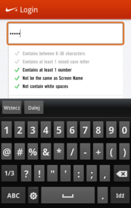
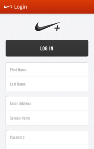
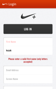
Less useful is the form validation mechanism in the Nike application+. Error messages are displayed, similar to Twitter, under the form fields. However, the form is designed in such a way that, for some fields, the messages cannot be displayed directly below the affected items.
Meanwhile, an interesting solution in the Nike+ app is automatic verification of password strength. Under the field where the password is entered, the criteria that it should meet are written out. When entering a password, individual items are automatically “unchecked”.
This mechanism makes it easier to come up with a password that will be accepted by the system.
Sports Tracker
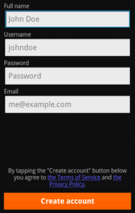
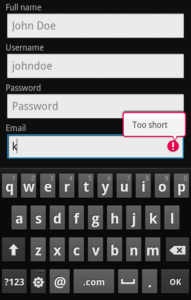
The Sports Tracker app combines the balloon mechanism used in the Skype app and the way Nike automatically verifies data+. As you enter data, messages appear in the clouds to show the status of the fields you are currently completing.
![]()
![]() However, the mechanism is annoying. E.g. When entering an email address, until the correct data format is entered, the message “enter a valid email address” is displayed. Provide a valid email address).
However, the mechanism is annoying. E.g. When entering an email address, until the correct data format is entered, the message “enter a valid email address” is displayed. Provide a valid email address).
Of the validation examples described above, I rate the Skype application form the highest. Thanks to the color scheme used, the balloons are clear and impossible to miss. Placing messages on a layer does not restrict us in constructing content, nor does it change the layout of form fields.
By far the least useful way to validate errors is the red symbol displayed when an incorrect username is typed in the Flipboard app. Failure to provide the reasons for the error prevents the user from fixing it.
Those interested in exploring the topic of mobile forms are referred to the articles:
- Removing Stumbling Blocks In Mobile Forms (http://www.smashingmagazine.com/2021/05/03/removing-stumbling-blocks-in-mobile-forms-2/), Theresa Neil, Rich Malley
- 4 rules for displaying error messages from a user experience perspective (http://www.nomensa.com/blog/2010/4-rules-for-displaying-error-messages-from-a-user-experience-perspective/), Nomensa
- The Ultimate UX Design of Form Validation (http://designmodo.com/ux-form-validation/), Marcin Treder
- How to Make Your Form Error Messages More Reassuring (http://uxmovement.com/forms/how-to-make-your-form-error-messages-more-reassuring/), Anthony
Article author:
 Krzysztof Kozak
[email protected]
UX Specialist, Symmetry
Logistician by training. He abandoned a career in shipping to look for bugs in interfaces. Particularly interested in mobile technology research and design for mobile devices.
Symmetry:  Symetria Agency – the only Polish company affiliated with the UX Alliance (an international association that brings together leading user experience agencies). Since 1998, Symetria’s experts have carried out projects for major Polish and foreign companies, including: Orange, Philipp Morris International, Credit Agricole, BZ WBK, Link4, Eurobank. http://www.symmetry.en
Title photo:
MK-Photo © More photos on Fotolia.en