
Mistakes made when designing RWD, or a few words about anatomy
RWD is an increasingly common solution when it comes to designing sites with mobile devices in mind. Especially in light of the recent changes in Google’s positioning, which has stopped positioning sites that are not adapted to mobile devices, it is worth enriching your knowledge on the subject. We have written about the advantages of the RWD solution many times, but just creating a reponsive site is not enough – you still need to do it right.
To this end, it is necessary to have a good understanding of users’ limitations in order to then take the best possible care of the site‘s UX.
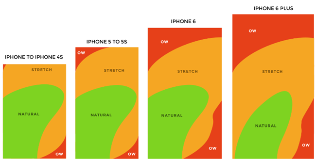
The main pitfall lurking for RWD websites is the problem of changing screen sizes of smartphones, which are increasingly moving towards phablets. While the average screen size increased by half an inch between 2007 and 2011, the that have seen much more dynamic changes over the past three years, that have caused phones to grow from an average screen size of 3.5 inches to more than five- and six-inch devices. On the one hand, this allows more content to fit on screens, on the other hand, anatomical limitations in the form of hand size and finger length mean that large screens carry more “blind spots” on mobile device screens.
Despite the fact that we increasingly “tap” with our index fingers rather than our thumb, it is still the case in many situations We prefer to use a smartphone with one hand, which sometimes requires quite a lot of acrobatics. For many years – until the iPhone 5 model – iPhone designers respected the anatomical constraints of the human hand, and iPhones’y lay in the hands almost perfectly. The user’s thumb was able to reach almost every point of the 3.5-inch and 4-inch screen quite freely. As the size of screens increases, user discomfort increases, Where operating the phone with one hand is becoming increasingly problematic.
In the image below, the areas that the user can freely reach with one hand (green), which he can touch with a bit of thumb strain (yellow) and blind spots, Which cannot be freely touched with one hand (orange area).
We already know the mass of advantages of RWD – the appearance of the site almost perfectly adapted to any screen size and displaying only the necessary functionality in a clear way. Now you should also take care to make the navigation of the responsive website as smooth and comfortable as possible, with medium-sized phablet screens in mind. When designing RWD solutions, you need to constantly be aware of the blind spots that are beyond the reach of your thumb.
How to do it?
Put the most frequently used functions in an easily accessible place
Navigation and CTA (call to action) buttons should be located away from the top left and bottom right corners of the screen, as these two places are the most difficult to access when using smartphones. At these points, it is worth placing buttons such as exit shopping cart or site logo to return to the home screen.
Reasonable choice of labels
In all types of forms, consider using labels inside form fields or underneath them. Placing labels inside form fields will save space, but can be confusing for users forced to fill out more elaborate forms. In view of this, for simple forms, where the user is asked, for example, the. about password and email, it is worth using labels inside the fields.
For more complicated forms, however, it’s a good idea to put captions directly below the fields to be filled out.
When the user wants to make a purchase, do not distract him or her
Pretty obvious, right? When a user wants to make a purchase via a RWD website, it is worth minimizing the navigation buttons or other distracting elements displayed at that moment. Buying on mobile is still not yet common, and the shopping cart abandonment rate is very high.
That’s why it’s a good idea to do your best to help the user buy – to enable the fastest possible sub-page loading time, minimize the number of sub-pages in the buying process, as well as the information provided on the screen. Ads, references to other products, links to social media – all this is unnecessary. If, in order to simplify the shopping cart, it would be necessary to create a shopping cart in a completely different convention than the rest of the RWD website, it is worth opting for this inconsistency.